
When you try to write a good resume, the professional header is one of the most important things that you should make on a high level. While all of your accomplishments and experiences are vital to an employer’s decision, they don’t matter if the employer never looks beyond the header.
A prospective employer might choose to stop reading if your header is already showing signs that you didn’t put in a lot of effort. Beyond that, many employers use automated systems to interact with resumes, now. Therefore, if your resume isn’t optimized to work with those automated systems, you won’t stand a chance at landing your dream job. It’s a sad fact of life, but a lot of extremely qualified people are never given a chance, and it’s all due to poorly made resume headers.
How Do You Make A Good Headers for Resume ?
There are several key features to the best resume header, and this easily digestible guide will cover all of them. If you simply follow the tips in the next few paragraphs, you’ll be on your way to creating the best resume headings in no time.
The following paragraphs we will give you some resume header ideas and will teach you how to pick the perfect:
![]() Font
Font
![]() Critical information
Critical information
![]() Extra information
Extra information
The Best Resume Header Format
Formatting is one of the most common issues with resume headers. Far too often, people choose confusing formats, or they use a format that can’t be acknowledged by automated systems. If you do the latter, most employers won’t even see your resume. With the prior, you run the risk of an employer putting your resume down at a mere glance. They’re busy people, and they get thousands of resumes a day. It’s important to make it as easy to read as possible.
To make your name stand out, it should either be centered, or it should be set to hug the left margin. You should never use a program’s built-in header setting. This is because many automated systems will not be able to read it. You can use basic text programs such as Word, but you should manually format the document yourself.
To make your name stand out, it should either be centered, or it should be set to hug the left margin. You should never use a program’s built in header setting. This is because a lot of automated systems won’t be able to read it. You can use basic text programs such as Word, but you should manually format the document yourself.
Below your name, you should put your area of expertise as a subheading. This gives the person reading it a very quick glance at your skill set, but it doesn’t overload them with information. Think of it as a piece of bait to get them to dig deeper into the resume.
Good examples of this are:
![]() Licensed Surgeon
Licensed Surgeon
![]() Certified Electrician
Certified Electrician
![]() Pharmaceutical Technician
Pharmaceutical Technician
Finally, you should have your most important contact information hugging the left margin, and right beneath your subheading. This puts your contact information in an easy to notice place, and the reader doesn’t have to dig into the resume to reach it. It also helps automated systems. If you have extra contact information, all of that should be placed to the right of your major information.
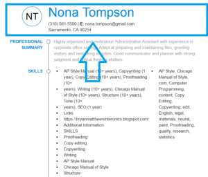
Here you can see correct resume header example (resume header template)

Best Resume Header Font
The resume font can make it, or it can break it. Employers are not going to sit around trying to decipher a header written in a crazy font. You also have to take into account how your font will stand out. Luckily, we have three great font suggestions that suit a resume header perfectly.
Best fonts for resume header:
Calibri
Calibri is one of the most common fonts for resume headers, and that is both a positive and a negative. Calibri is an easily readable font, but the majority of job seekers use it. It will be difficult for your resume to stand out if you use Calibri. The overall readability of your resume will be maximized, though. In addition, it’s important to note that Calibri is not an open source font. If it didn’t come with your text program, then you’ll have to pay for it. If you want a great alternative, you can always use Carlito. Carlito made specifically as an open source alternative to Calibri.
Georgia
Unlike Calibri, Georgia is a serif font. The majority of people use sans-serif fonts to maximize their resume’s readability. For this reason, using Georgia can give you a slight advantage by making your resume look different from the rest.
Verdana
If you want a great sans-serif font that isn’t used as much as Calibri, Verdana is a great choice. It’s easily readable, but it different enough from the most commonly used fonts that it will still stick out. That makes this the perfect choice for a font that covers both factors equally, but doesn’t really excel at either.
Here you can see another resume header examples
Contact Information
Nothing in your resume matters if there isn’t a way to contact you. For the most part, that means that you should add your phone number, address, and email address to the major information section that we mentioned earlier. Those three things are the only bits of information that should make it into your main information section. If you add more, you clutter it up and lower the readability of the entire resume header.
Extra Contact Information
It’s okay to add more contact information. However, you should keep your extra contact information separate from your main information. If you clutter up the information section too much, the most common ways for an employer to contact you might get lost in your extra information. They will not try to find out what information is what. They’ll simply put your resume down, and they will move on to another applicant.
All of your extra information should pertain to contacting you, or it should show off your most notable accomplishments. In general, this means that you should include your LinkedIn profile, or you should add your portfolio web page. If you have another profile or web page that shows off your accomplishments, you can add that to your extra information, too.
However, you should refrain from putting your personal social media accounts in your resume header. Employers will go to your social media pages, and they will look for any pictures or posts that make you look bad. That can mean that a simple picture of you at your local bar could keep you from getting a job. Now, the context of those pictures can completely justify them, but prospective employers aren’t going to look for context.
If you’re applying for a job that needs to see your social media account, you should use a program or service that cleans your account of any unseemly posts. Since you’ll have to link your social media accounts for jobs like that, you won’t want to take the risk that you have an even remotely inappropriate picture on your account.
Conclusion
Making a perfect resume header seems difficult. However, all of the best resume headers use the tips provided above to maximize their effectiveness. You don’t have to struggle to make your resume header. You just have to take these simply tips, and then you have to utilize them.
As a quick recap of the tips above, you should follow these bullet points:
![]() Keep your name and title centered, or in the left margin.
Keep your name and title centered, or in the left margin.
![]() Use one of our suggested fonts, and make your name very large.
Use one of our suggested fonts, and make your name very large.
![]() Your main information section should only have your phone number, address, and email address.
Your main information section should only have your phone number, address, and email address.
![]() Keep social media accounts off. It can only hurt your chances at landing a great job. If the job requires it, enlist the help of a service that cleans up social media pages.
Keep social media accounts off. It can only hurt your chances at landing a great job. If the job requires it, enlist the help of a service that cleans up social media pages.
![]() Last, but certainly not least, proofread your resume header. This is not covered in the bulk of this guide, but employers will see spelling errors and immediately reject you. Make sure that your resume header is written perfectly.
Last, but certainly not least, proofread your resume header. This is not covered in the bulk of this guide, but employers will see spelling errors and immediately reject you. Make sure that your resume header is written perfectly.


 (3 votes, average: 3.67 out of 5)
Howdy! I could have sworn I’ve visited your blog before but after looking at many
of the articles I realized it’s new to me. Nonetheless, I’m
definitely delighted I found it and I’ll be bookmarking it and checking back regularly!